Works - Photos

Poppy Slattery
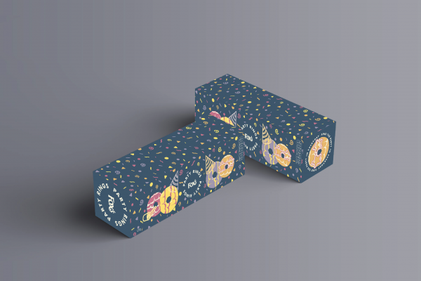
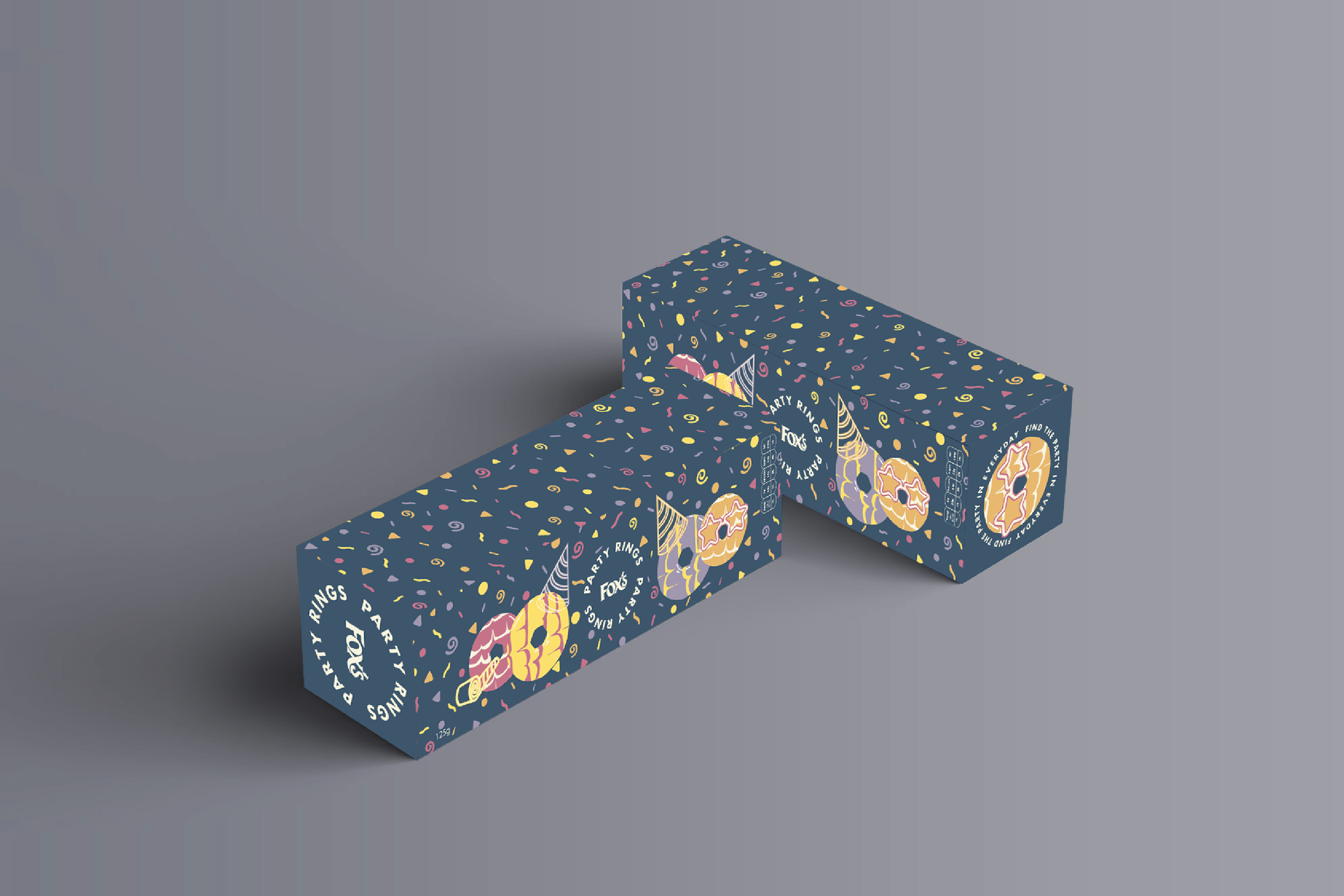
Party Rings Redesign
Brief: Redesign Fox's Party Rings for the contemporary consumer.
Solution: Taking the fun, youthful characteristics of the current Party Ring identity and redesigning it for the modern market so that the biscuits appear relevant and fresh for adults who are aware of the product and will be intrigued by the biscuit's new image.
Solution: Taking the fun, youthful characteristics of the current Party Ring identity and redesigning it for the modern market so that the biscuits appear relevant and fresh for adults who are aware of the product and will be intrigued by the biscuit's new image.

Poppy Slattery
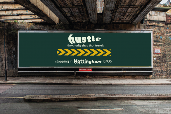
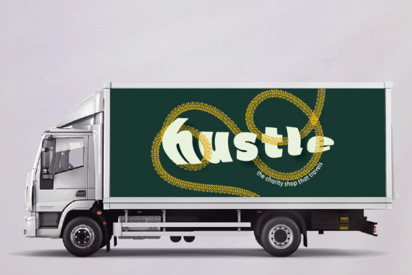
Hustle
Brief: Bulletproof randomly generated brief, ‘A charity shop called Hustle’,
Solution: Inspired by the idea of 'hustle' suggesting movement and being amongst crowds. Hustle is the charity shop that travels, bringing products to the people. Visually I was inspired by the tracks and movement of vehicles creating a contemporary charity shop design that is fitting with this modern reconception of the charity shop to appeal to the young, urban audience.
Solution: Inspired by the idea of 'hustle' suggesting movement and being amongst crowds. Hustle is the charity shop that travels, bringing products to the people. Visually I was inspired by the tracks and movement of vehicles creating a contemporary charity shop design that is fitting with this modern reconception of the charity shop to appeal to the young, urban audience.
Poppy Slattery
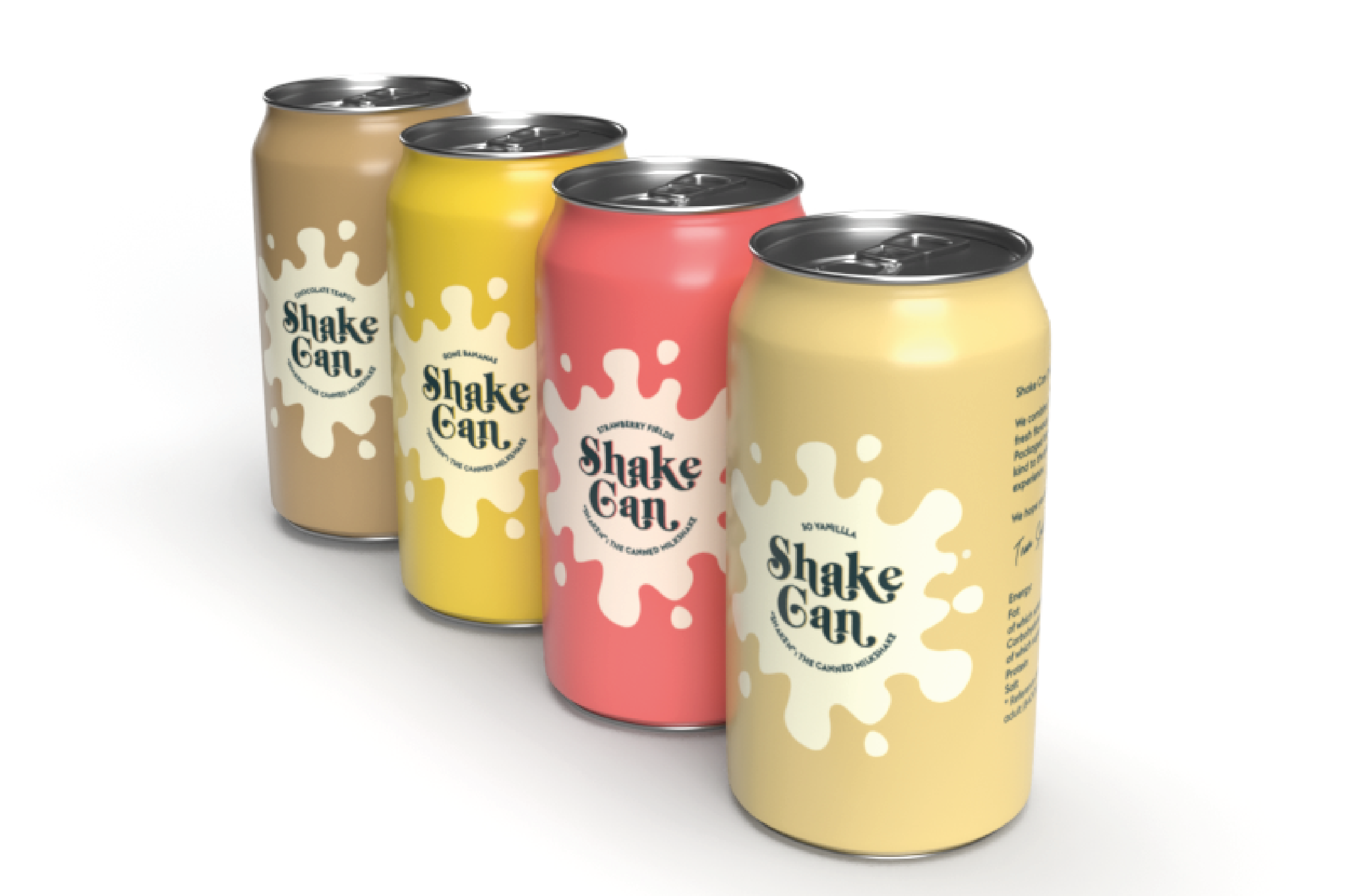
Shake Can
Background: ‘Grab and Go’ milkshakes are predominantly sold in plastic packaging which is known to have large, environmental consequences. Aluminium cans are a more sustainable packaging option and are used widely by premade iced coffee brands suggesting that they are a realistic alternative to plastic bottles in packaging milkshakes.
Brief: Design a milkshake brand that uses canned packaging.
Solution: Initially inspired by the American diner aesthetic that is associated with milkshakes I designed ‘Shake Can’ (“shaken”). Shake Can takes aspects of classic American diner signage and common imagery associated with milkshakes to create a contemporary alternative to the current pre-made milkshakes market, with a modern design and sustainable packaging that reflects current consumer demands.
Poppy Slattery
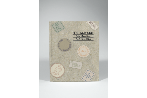
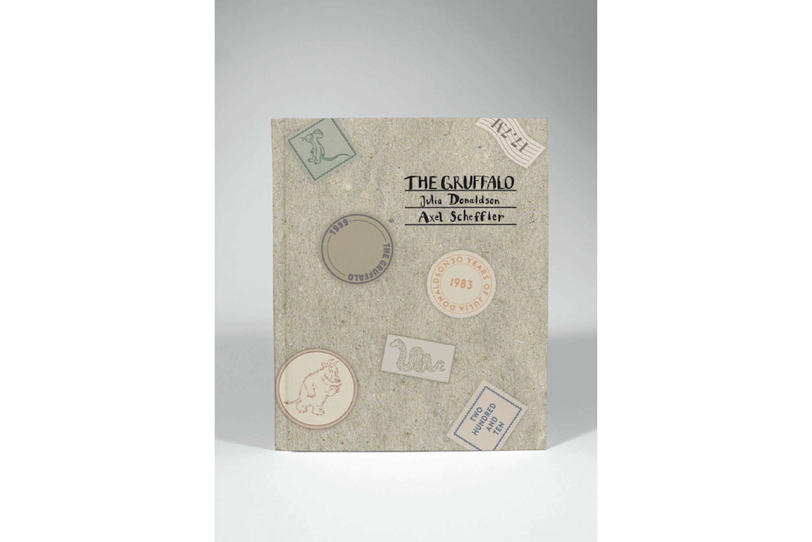
30 Years of Julia Donaldson
Background: Julia Donaldson is a well-known writer and playwright, most known for her children's, rhyming literature.
Brief: Redesign the covers of the Julia Donaldson books to celebrate 30 years since the release of her first book, 'A Squash and a Squeeze'.
Solution: In researching Julia Donaldson and Axel Scheffler (Illustrator) I found a reoccurring theme of letters. Donaldson wrote and drew on envelopes as a child, Donaldson, and Scheffler send letters to one another that Scheffler illustrates with characters from the books, and to celebrate 20 years since the release of the Gruffalo in 2019 special edition stamps were designed. I have therefore taken the starting point of letters to develop this series of book covers.